
HOW DO YOU TELL A STORY THROUGH A FONT?
- Nov 8, 2022
- 2 min read
Updated: Nov 9, 2022
As we plan for the opening of our new store, Patina Home & Garden, there’s definitely a lot to plan. And isn’t it funny how sometimes the small things are what become incredibly important?
Steve and I are big proponents of intentional living and I talk more about it in a blog post called Why We Do What We Do. And as we began working on a new logo with our designer Meghan Aileen, we began wondering, How do you tell a story through a font?
HOW WE CHOSE THE FONT FOR PATINA HOME & GARDEN
We started with a font that was similar to the one we use on the cover of our books. The font was very pretty, curvy, and script-like.

After sitting with it a bit, I went to Steve and said, “Something doesn’t feel right.” He immediately agreed, so we began to think about it from a different angle.
We realized that what felt off was that the pretty style was good for Patina Home & Garden, but it didn’t work with Leipers Fork.

The building our shop will be in was the old general store and the place people came to for everything they needed. The historical feel and small town gathering place is a fundamental part of the inspiration behind everything we’ll be doing, so we wanted to honor the tradition.

As we often do for our design projects, we began researching the history behind the subject matter. We looked at old fonts from apothecaries, pharmacies, and physicians.

We started to come across fonts that reminded us of one that Steve uses in his architectural drawings. It’s a little bit Romanesque and fits well with our approach to design and creativity.

As we narrowed the choices down, Meghan told me that it was surprisingly hard to zero in on the right option. If she veered just a bit, we ended up looking like Vogue — which doesn’t really match our style either!
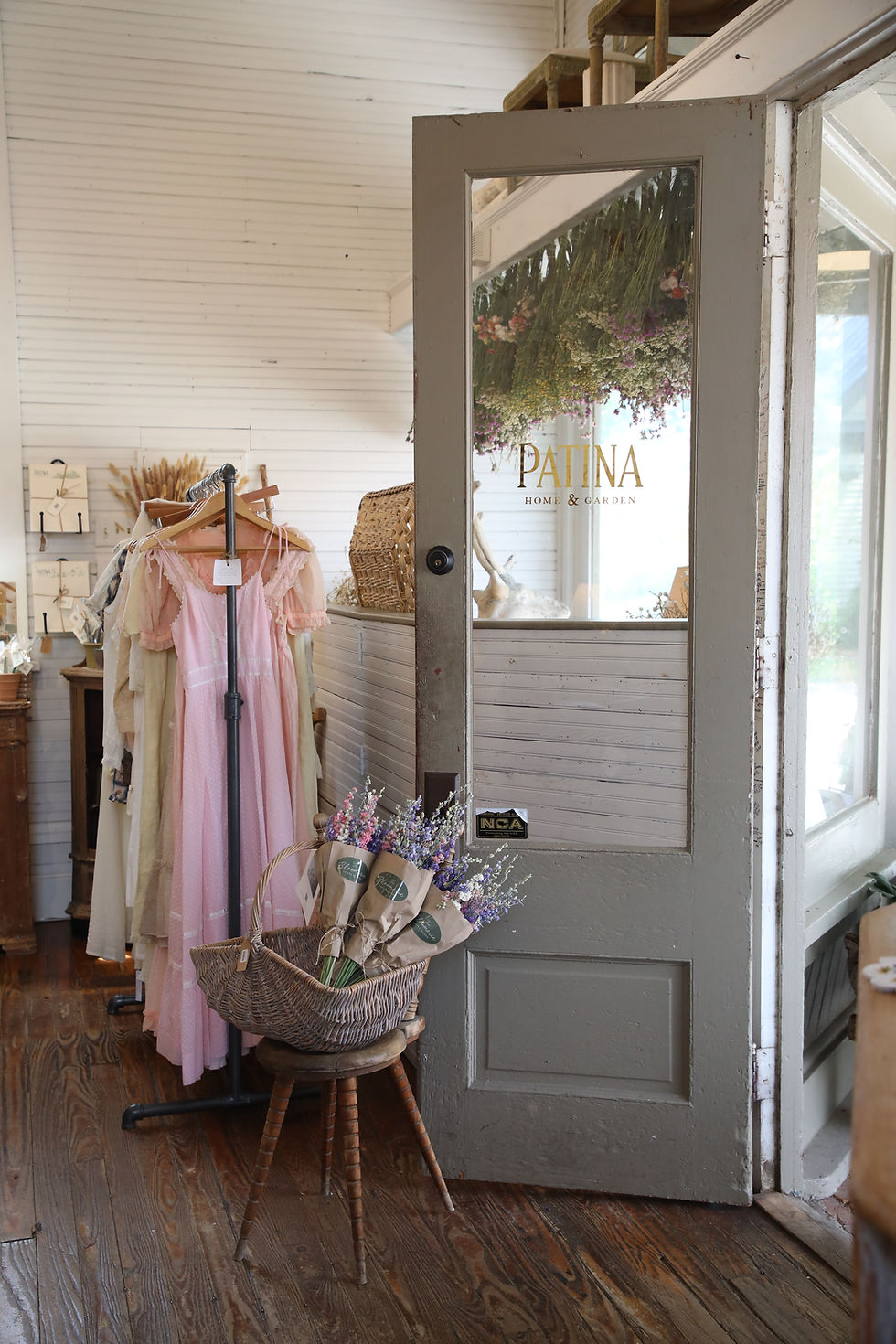
Ultimately, we all agreed that none of the fonts felt just right, so Meghan designed one that felt true to those old fonts we love! We used her design for "Patina", and used a font called Alchemist for "Home & Garden" to create our perfect logo.

The logo for Patina Home & Garden now feels like it unites our hopes and dreams while honoring the history of our new hometown of Leipers Fork.
Make sure you’re following along with us on Instagram to see how things progress as we get closer to the store’s grand opening!
xo
Brooke


For what it's worth, the new signage is very appealing.